top of page

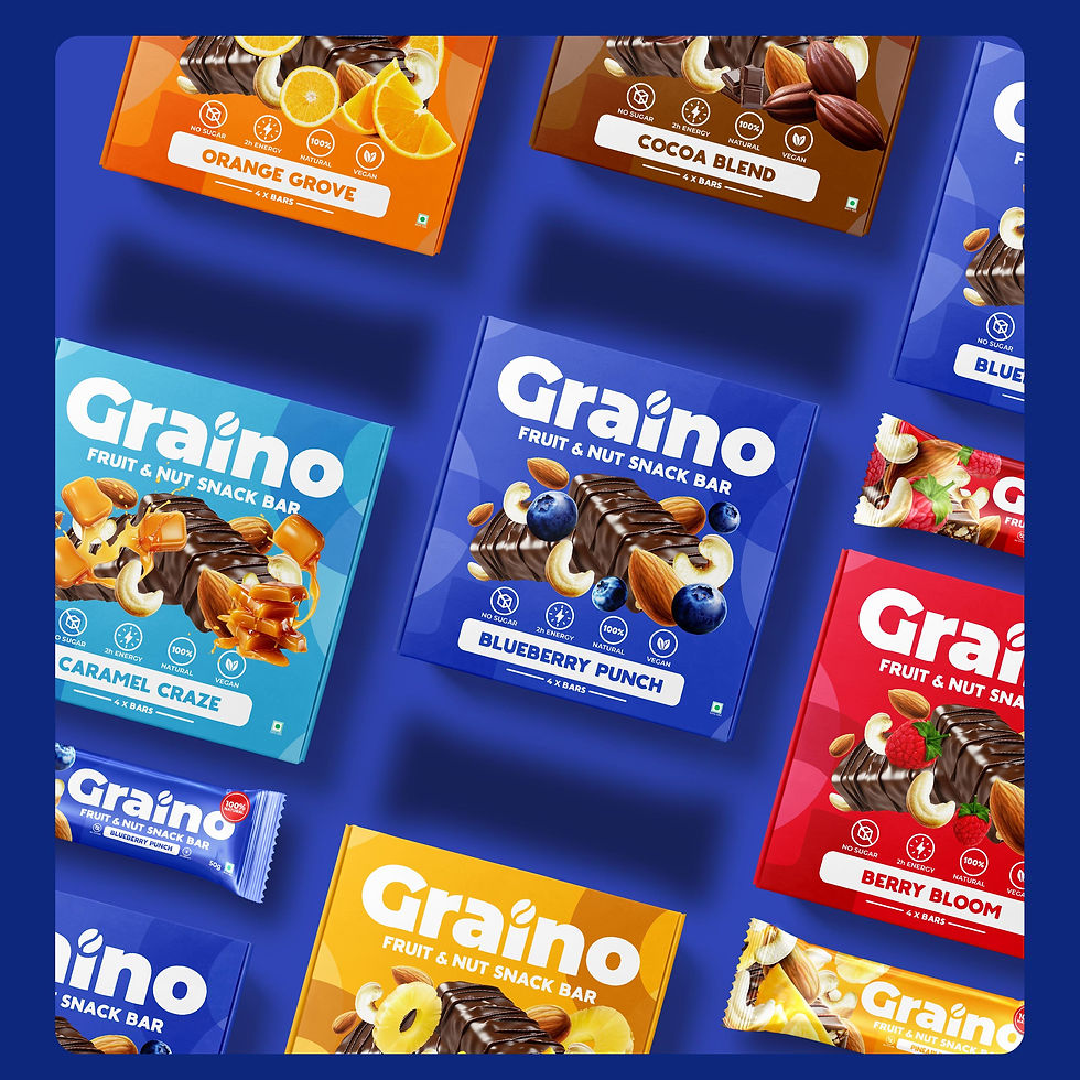
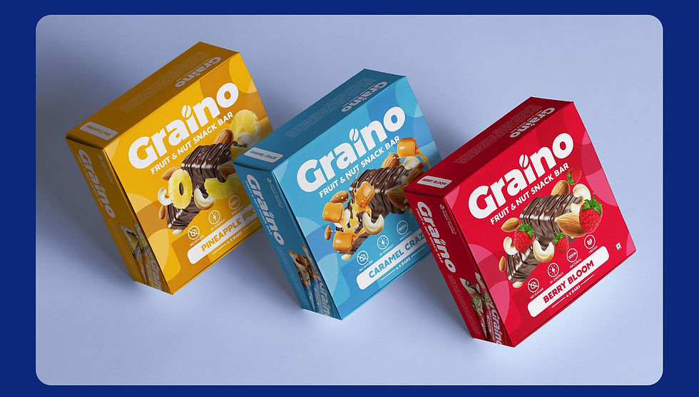


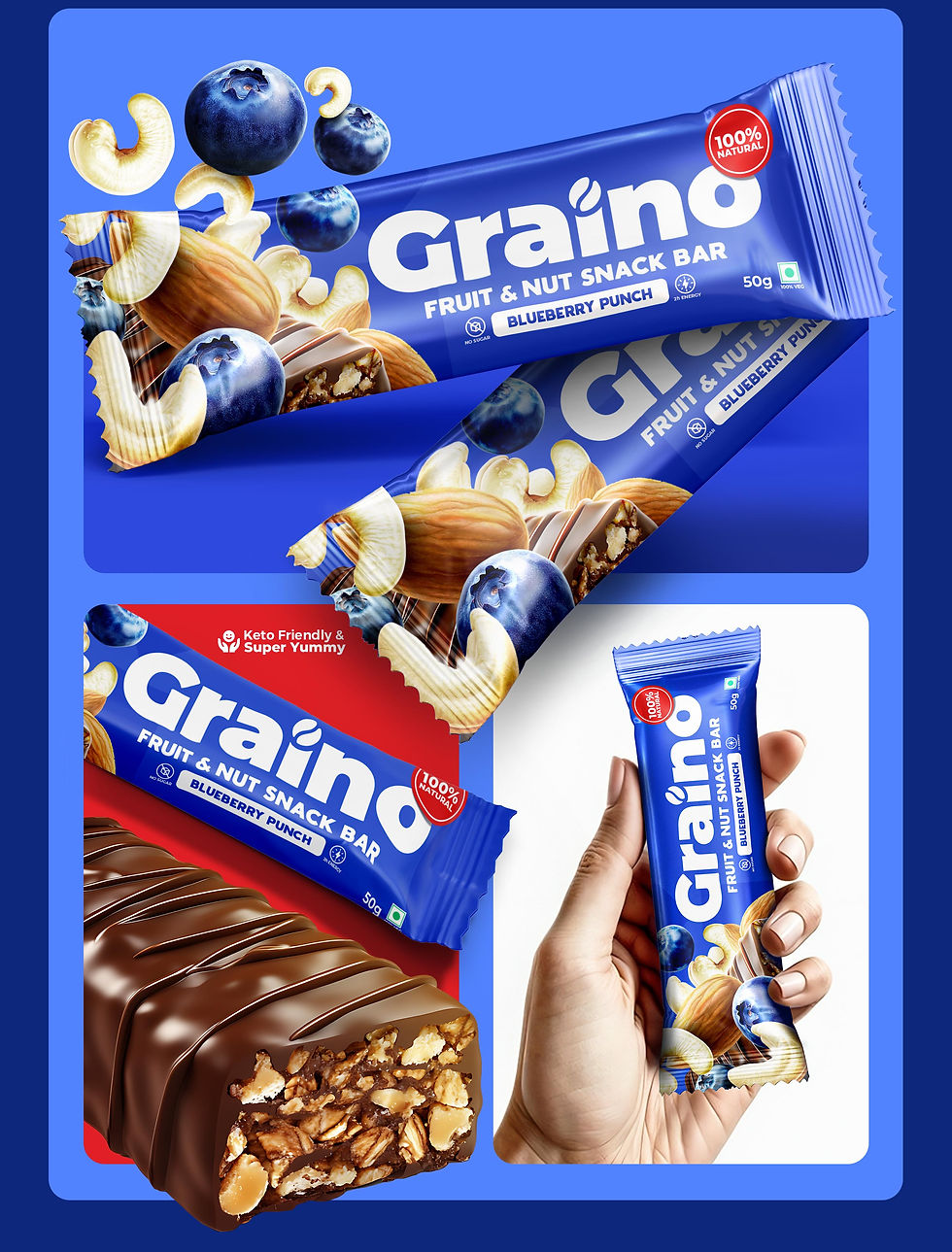
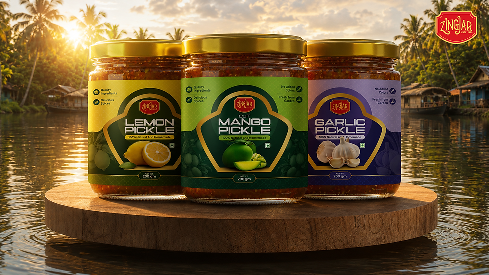
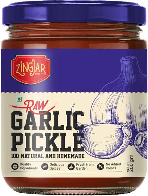
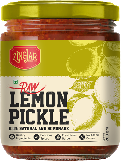
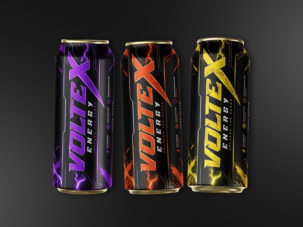
We developed a versatile, user-friendly design system scalable across markets and languages. Paired with a cohesive off-pack visual language, the system ensured brand consistency and was effortlessly extended as new ranges were introduced into the Graino’s portfolio.


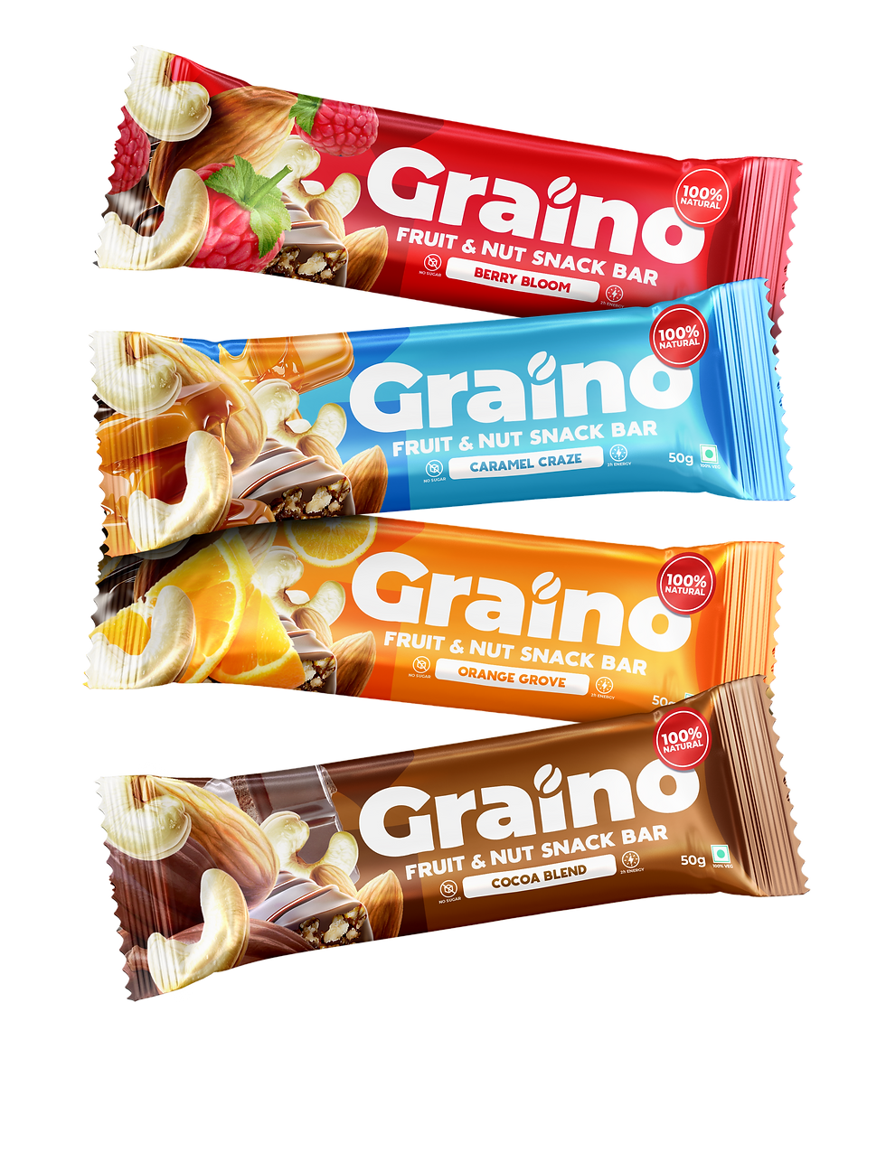


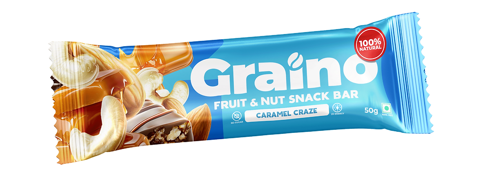

Our challenge was to visually express Graino’s authentic flavour and satisfying texture across diverse global markets. We needed a distinctive and ownable design language
one that could evoke appetite and clearly communicate the brand’s essence. Structure was everything: with a clear hierarchy, we could elegantly spotlight the brand, product, and nutritional benefits in a way that feels seamless and premium.
A refined balance of innovation & consistency










bottom of page